Superside Rebrand & Rollout
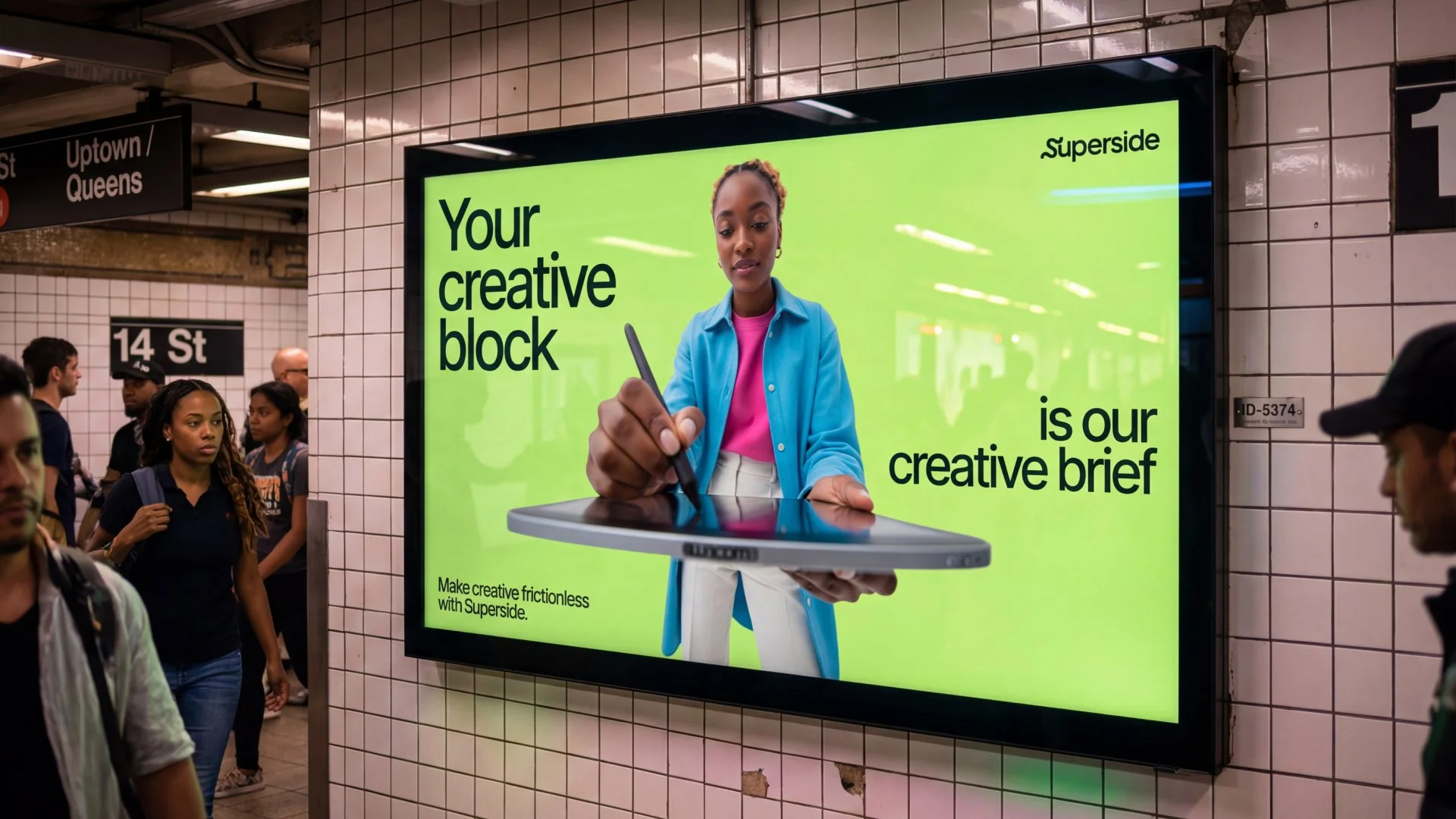
Superside had outgrown its own branding. The company was making work for Amazon, Meta and Google while still wearing the identity of a smaller, younger version of itself.
The brief was to catch the brand up to the business, and to prove Superside's own argument while doing it: expert creatives with AI in their hands make more, not less. So the rebrand ran on the model it was selling. 92 creatives, 15 to 20 AI tools, 8 months from kickoff to launch against an industry norm of 2.5 years.
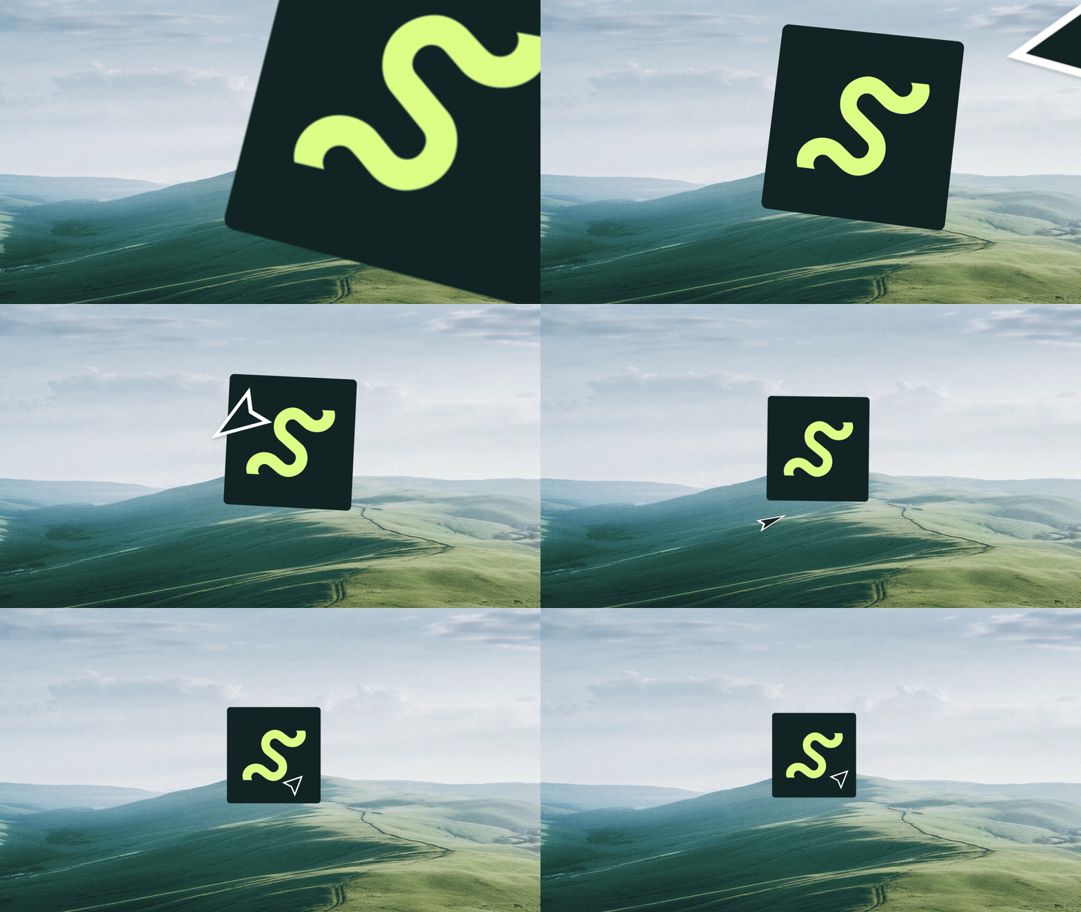
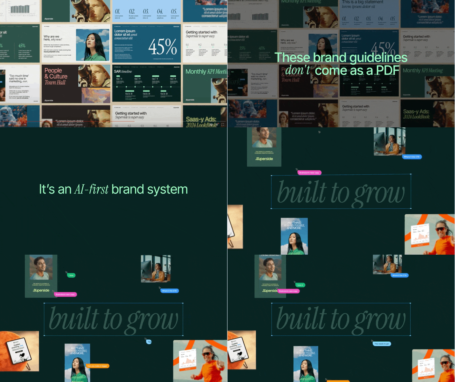
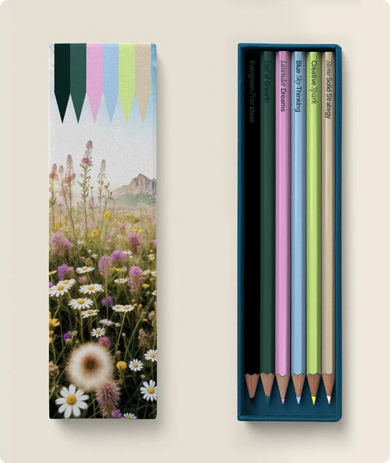
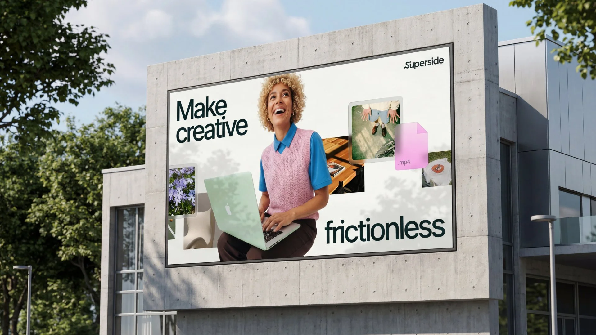
What landed at the end of 2024: a refined logo, an S Squiggle for the places the full mark can't breathe, a nature-inspired palette running from extraterrestrial green to grounded neutrals, and living Figma guidelines in place of a static PDF. Through 2025, the team built it into a system 700 people could work in, across film, sales, imagery, copy, and events.
AWARDS
Bronze • The Drum Marketing Awards: Superside rebrand
Agency: Superside
VP Marketing: Jen Rapp
Executive Creative Director: Kae Neskovic
Creative Directors: Graeme McCree, Piotr Smietana, David Milsom
Copywriter: Joshua Roscoe, Sam Newdigate
Graphic Design: Tomas Castiglioni, Paula Del Mas, Lucas Yu, Andrea Paz y Miño, Daniel Borjas, Devin Terrey, Grethe Meissner, Francisco Quinche
UX/UI Design: Camila Giannini, Facundo Alzarría, João Martins
Motion Design: Lucia Duclosson, Alexandre Golias
Project Management & Operations: Sofía Bittolo, Iliada Karamintziou

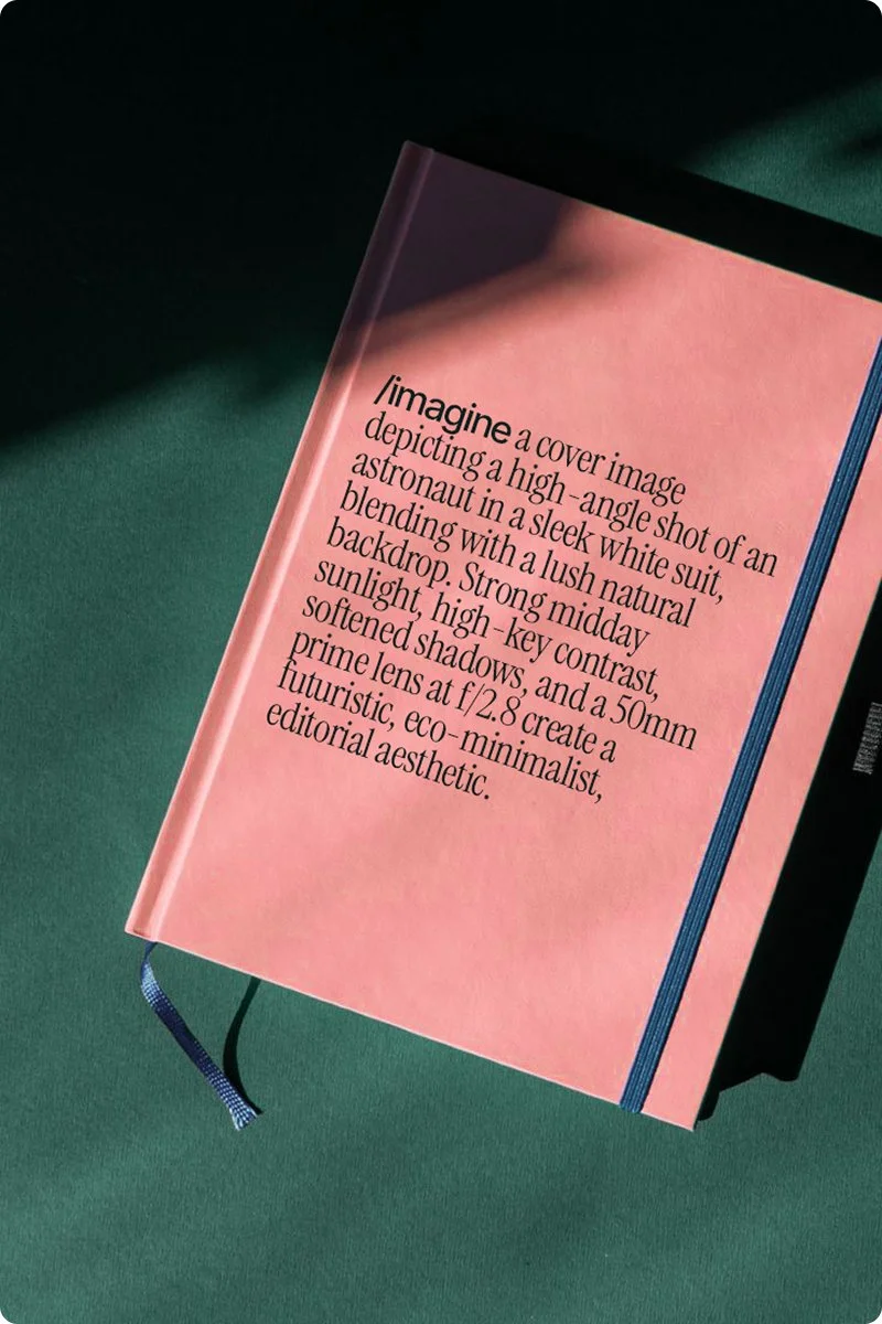
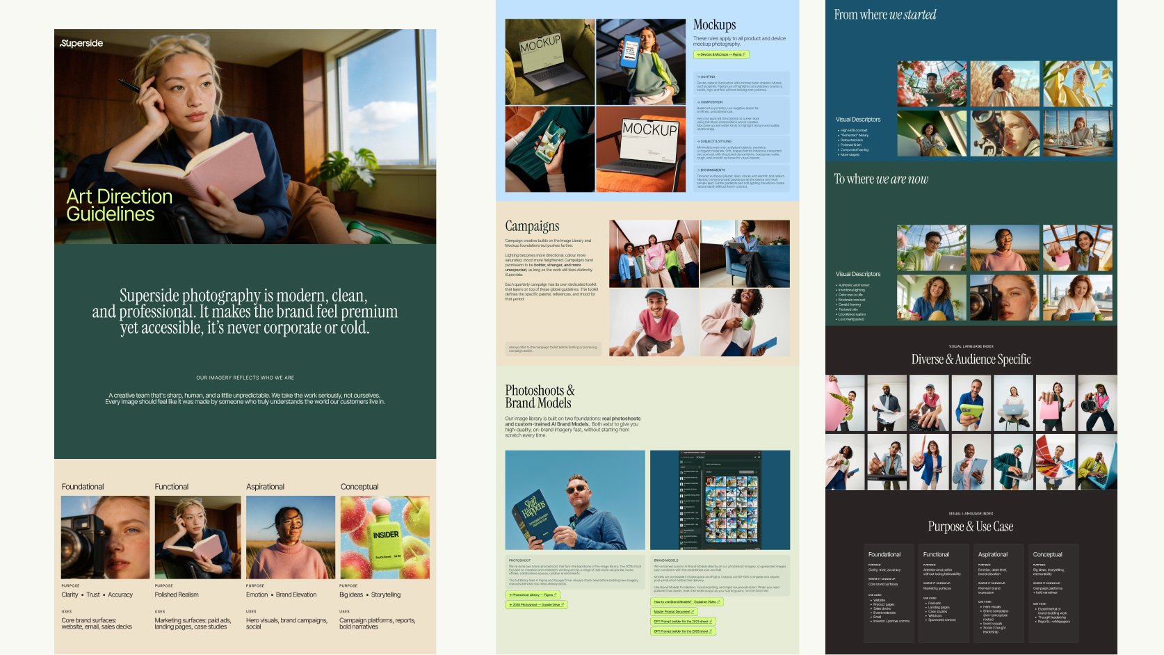
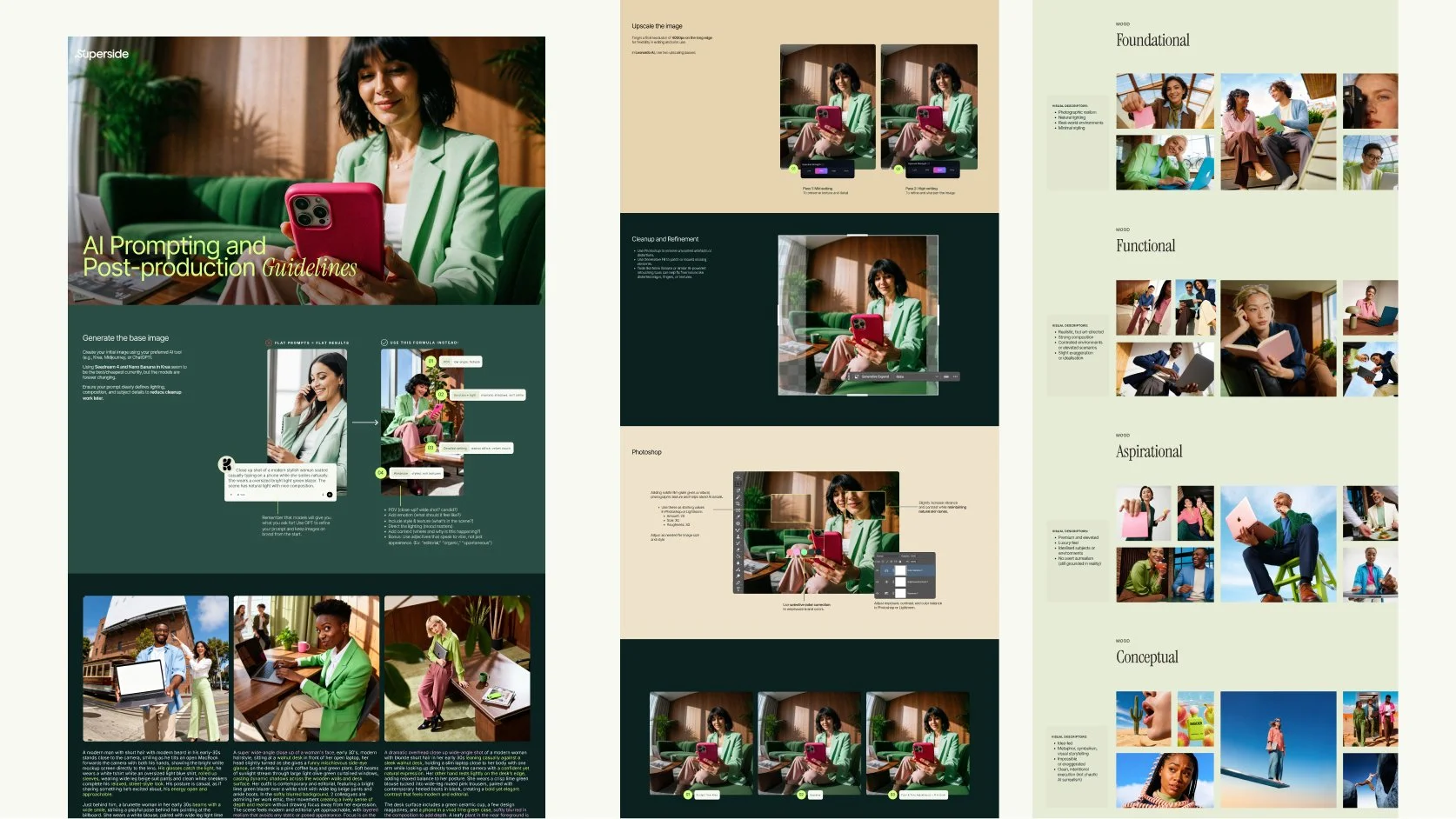
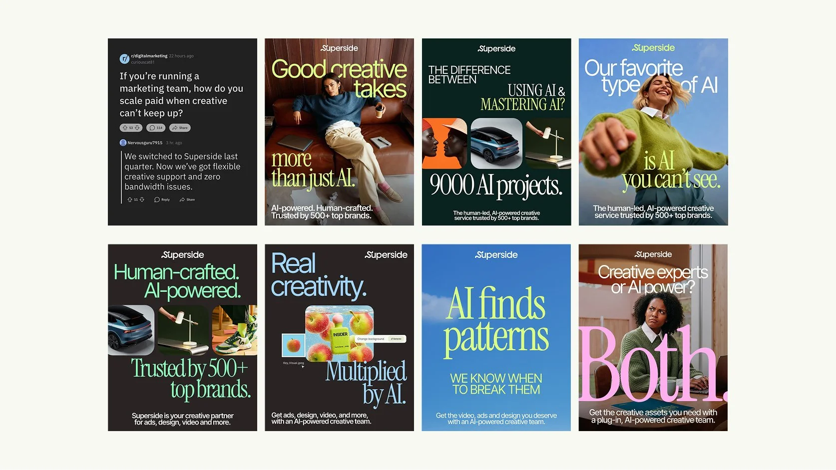
HOW THE BRAND SEES • As a creative company putting AI in the hands of experienced creatives, we wanted to show how the brand could use AI images to represent our target audience and the creatives making brand work. We reworked Superside’s photo art direction and image treatment to feel warm and optimistic, with a lifestyle, editorial approach, to stand out from typical SaaS companies. We created a new library of generated images. To let the company generate on-brand images without a designer checking every one, we built on-brand image models into the Superside user platform, giving everyone access to the image style.
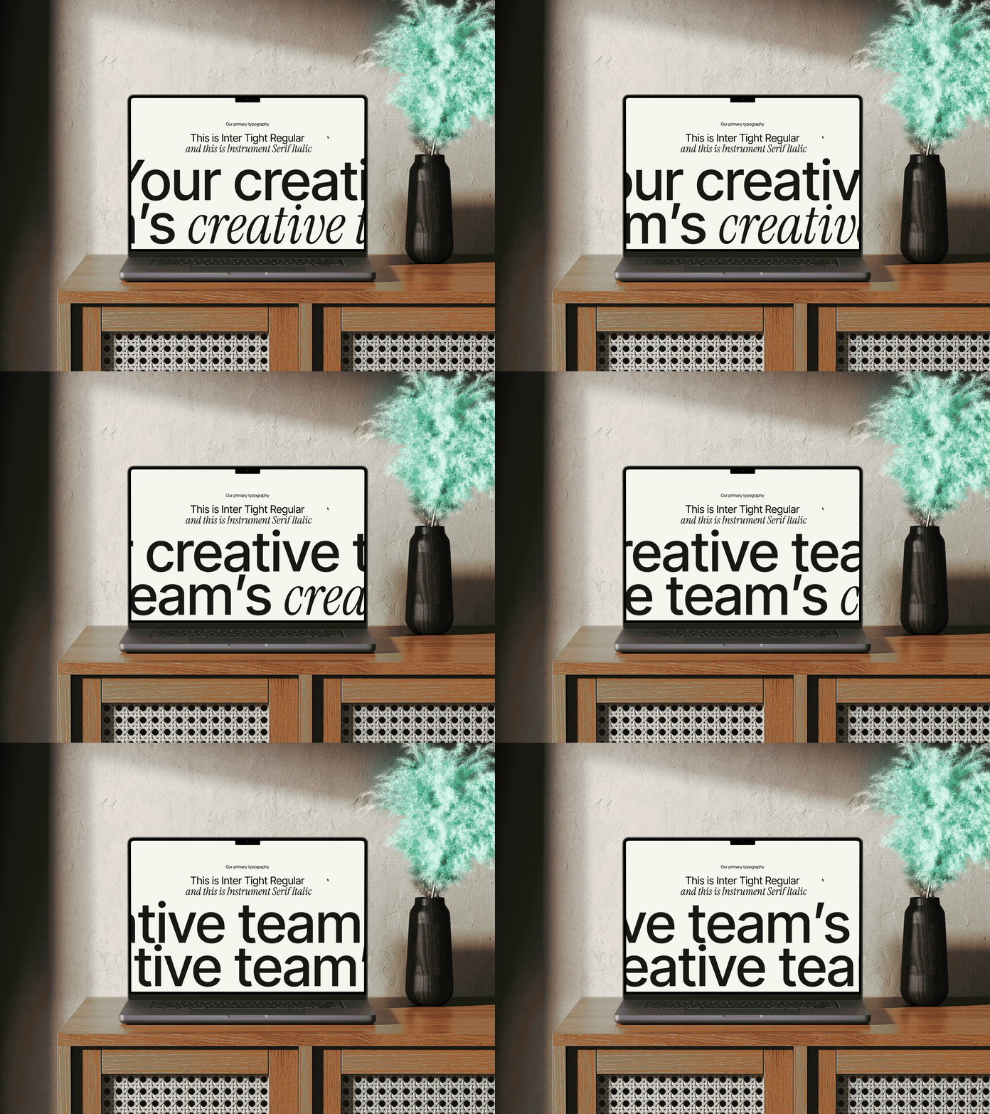
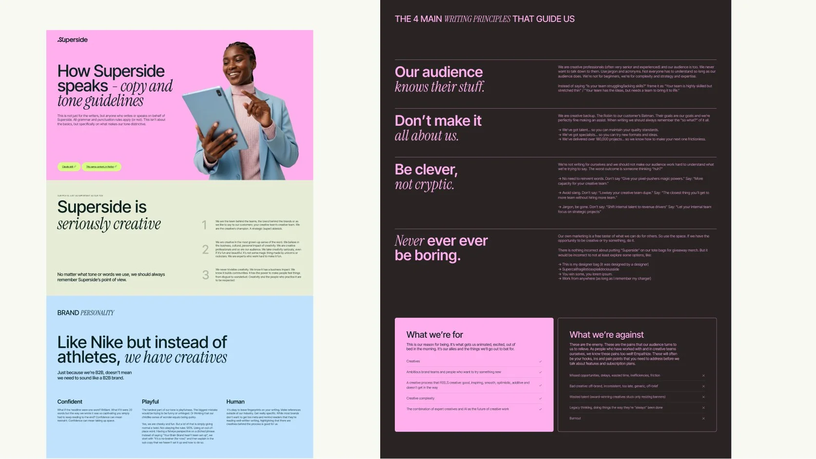
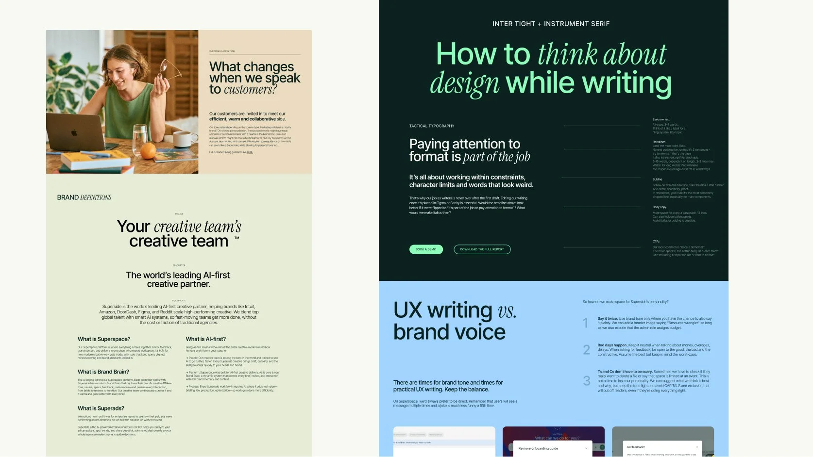
HOW THE BRAND SPEAKS • Instead of one general voice document, we wrote copy guidelines by use case: web, events, ads, social, video, plus a tone of voice guide for anything customer-facing. The guides live in Notion, and I turned them into a Superside tone-of-voice skill in Claude. So anyone can pull them to keep Marketing, Sales, Product, and other teams aligned on the same tone of voice across their communications and output.
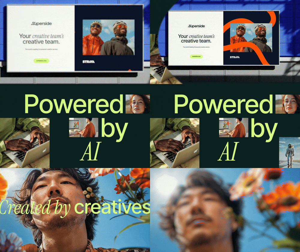
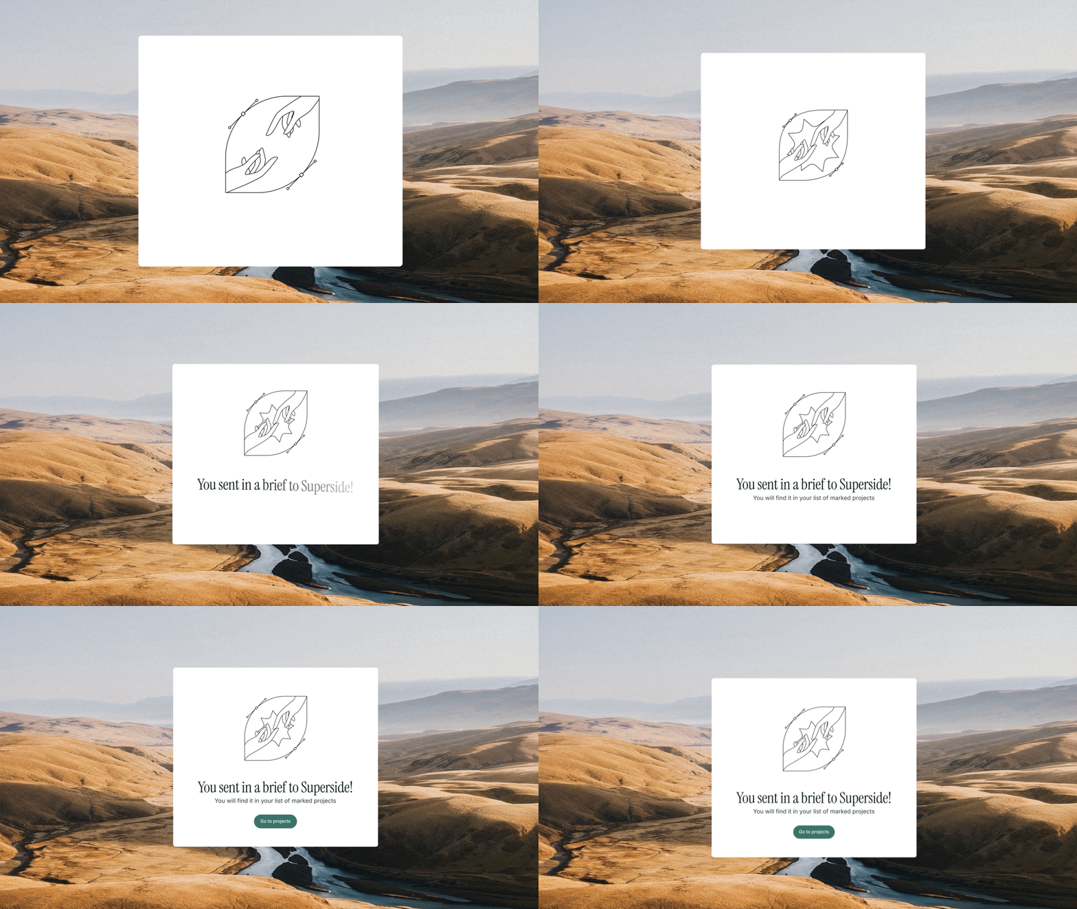
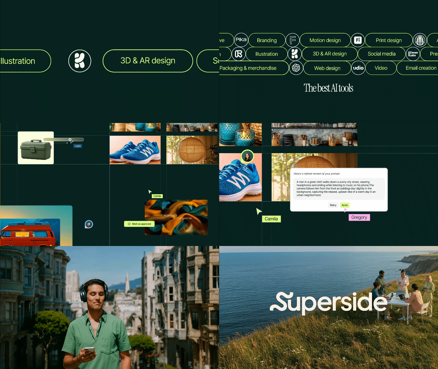
HOW THE BRAND MOVES • Most people met the new brand in motion in the announcement video, the 2025 overview showreel, and service showreels for AI, video, 3D and web. Alongside the motion designers, we built what sits underneath it all: motion and storyboard templates, so a 3D reel and a web reel look the same as the motion campaign ads and GIFs in sales decks, no matter which motion designer made them.

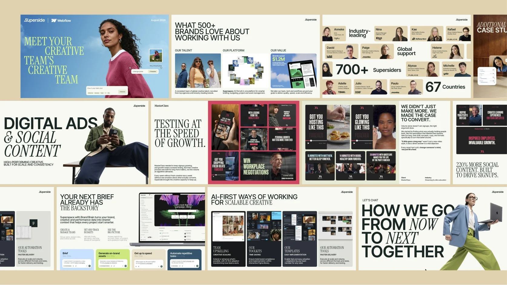
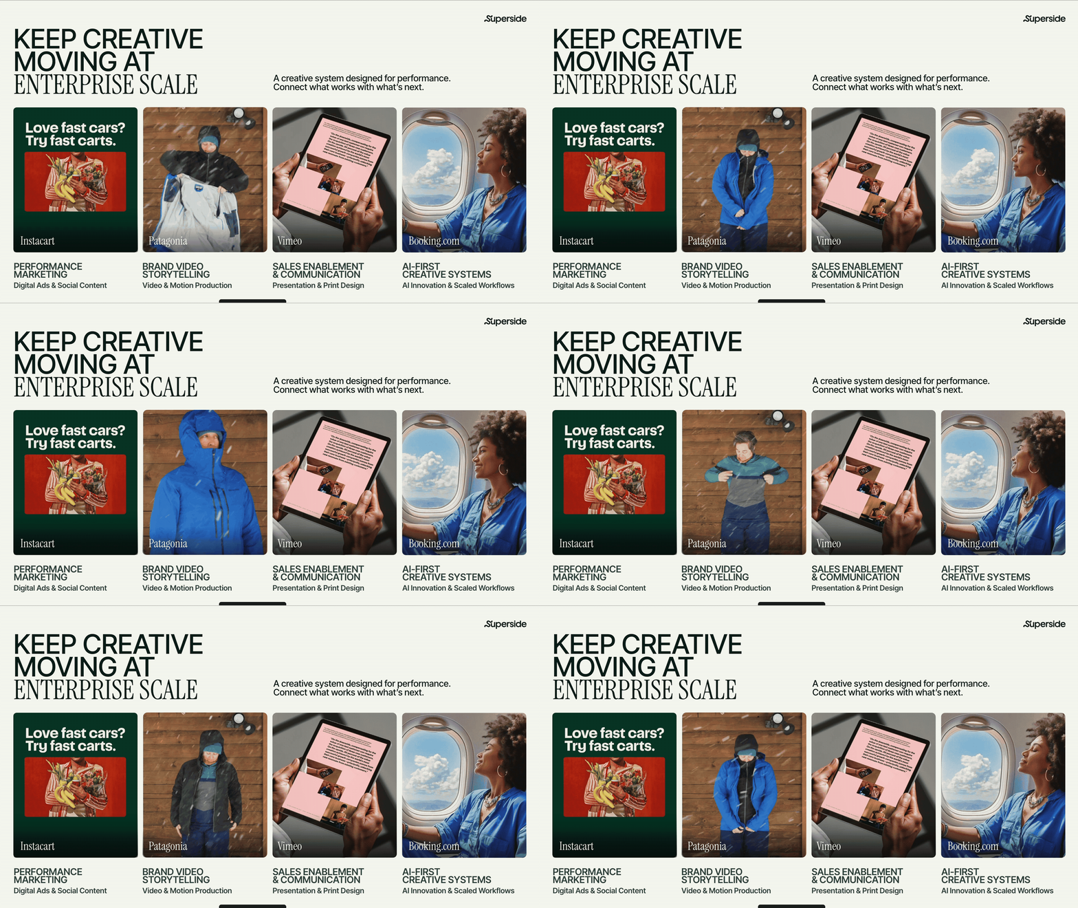
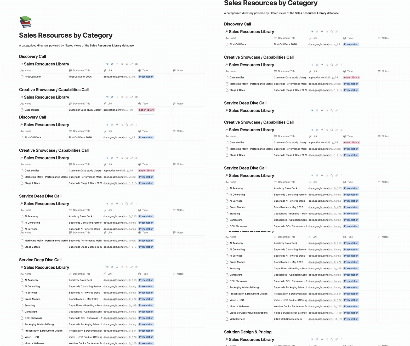
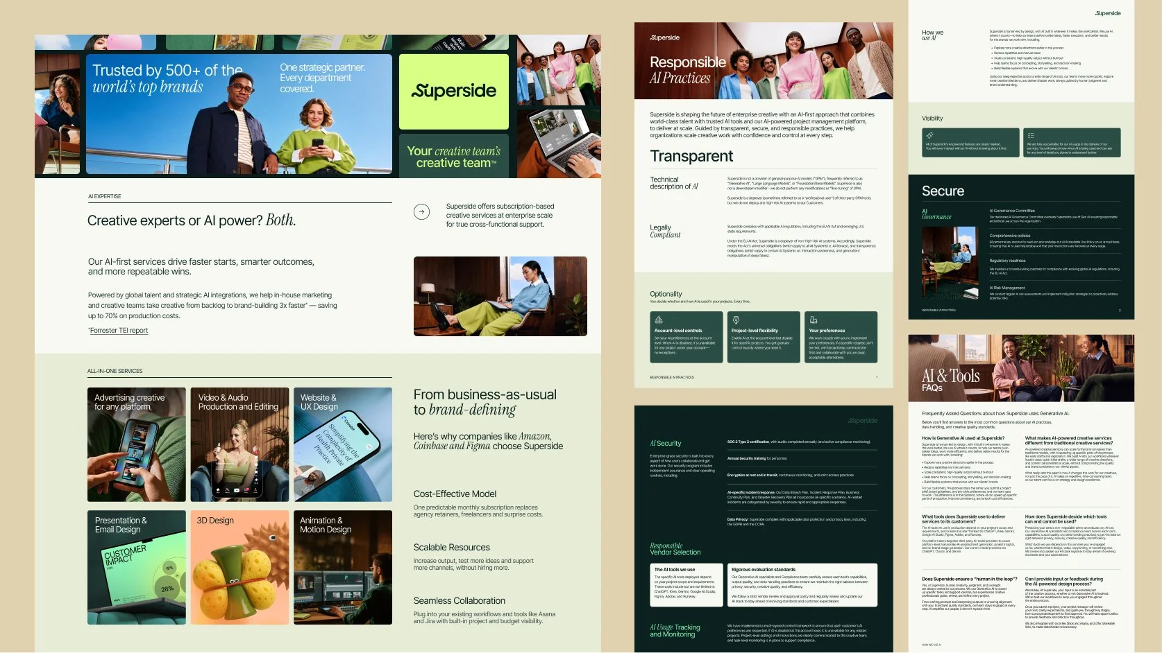
HOW THE BRAND SELLS • I rebuilt the sales enablement library end-to-end: decks, showcases, service explainers, one-pagers, all in the new identity. Converting enablement content into the new identity was the easy part. Getting AEs to find the right asset instead of the nearest one was harder, and for a long time I was the Superside sales enablement librarian. Moving everything into Notion made it searchable. Building it into Claude made it something an AE could ask, not just search: which case study fits this deal, what to say to the person in the room and how to customise content to each opportunity.
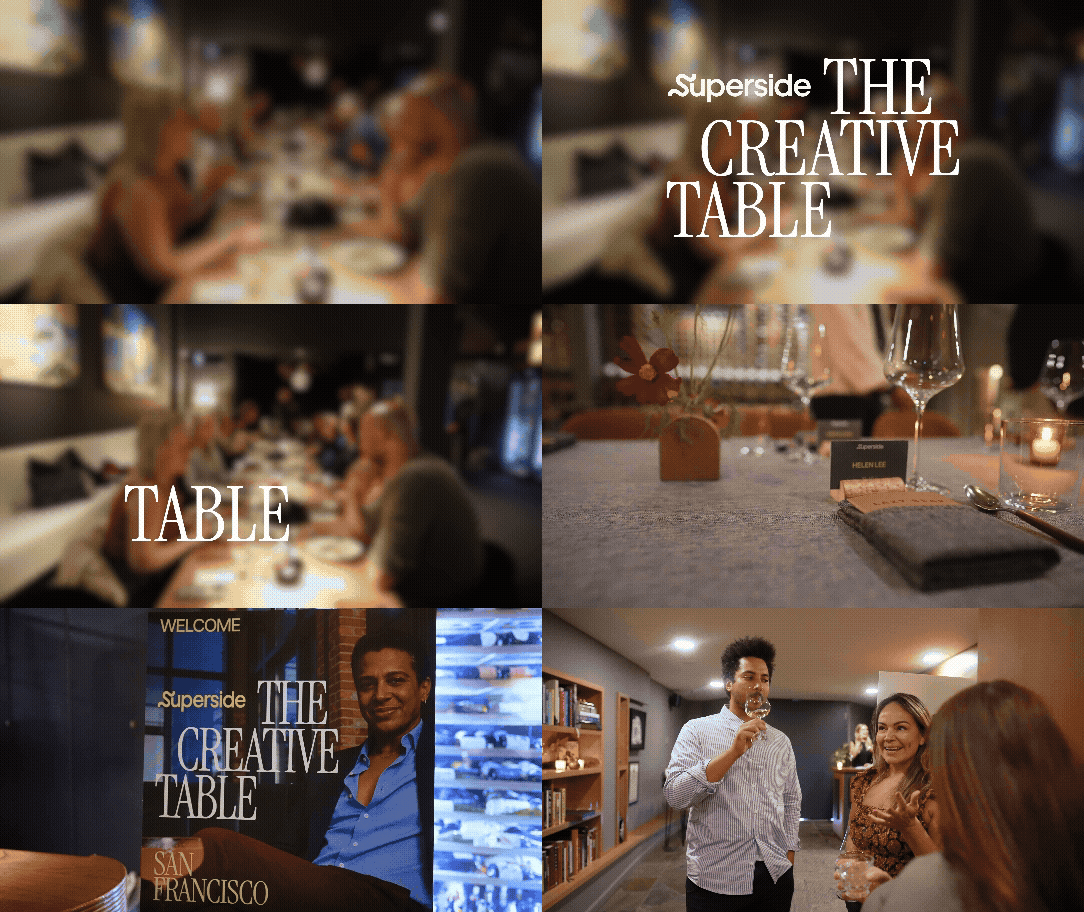
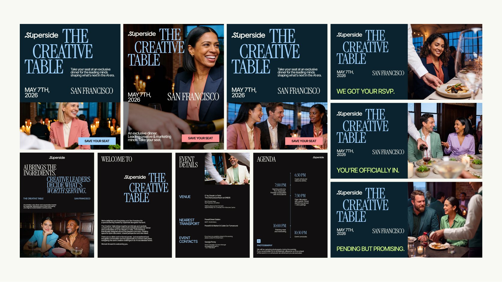
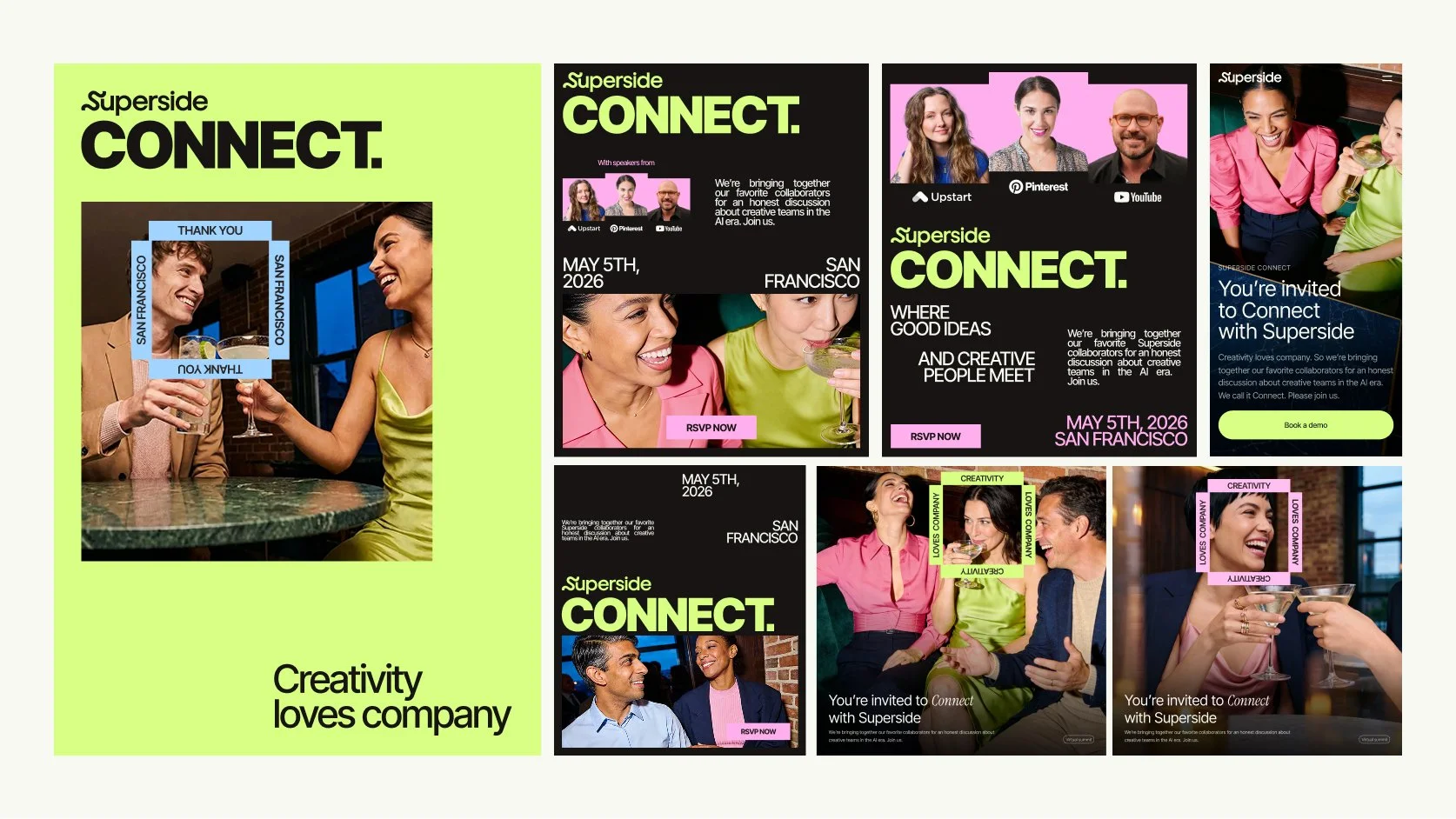
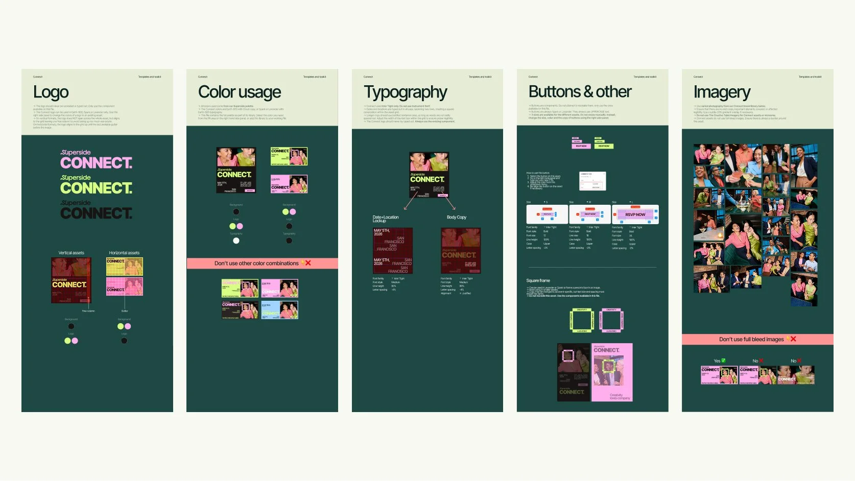
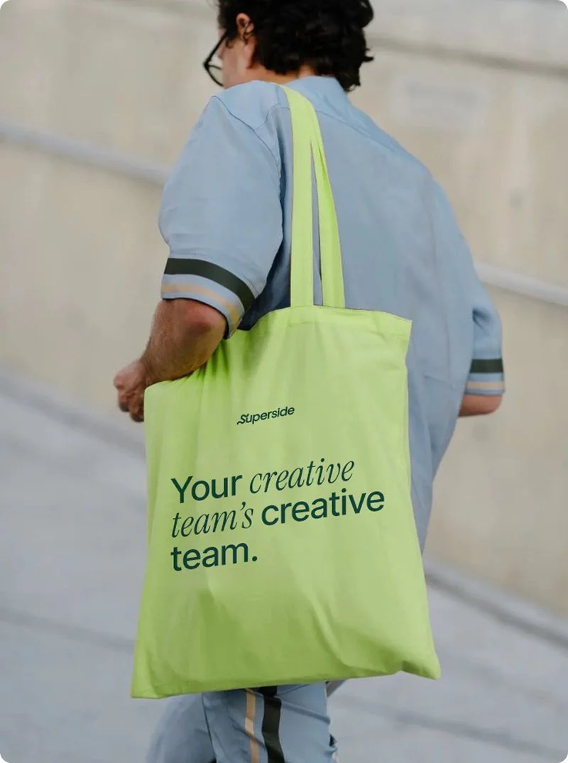
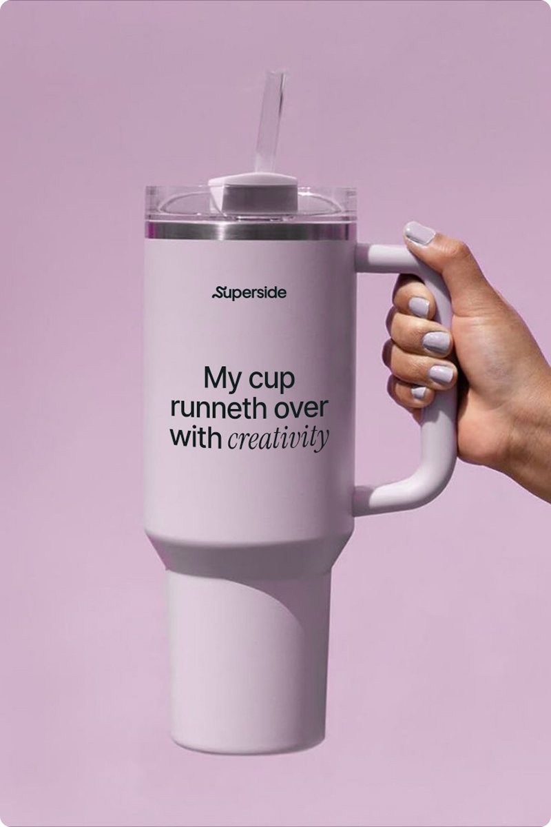
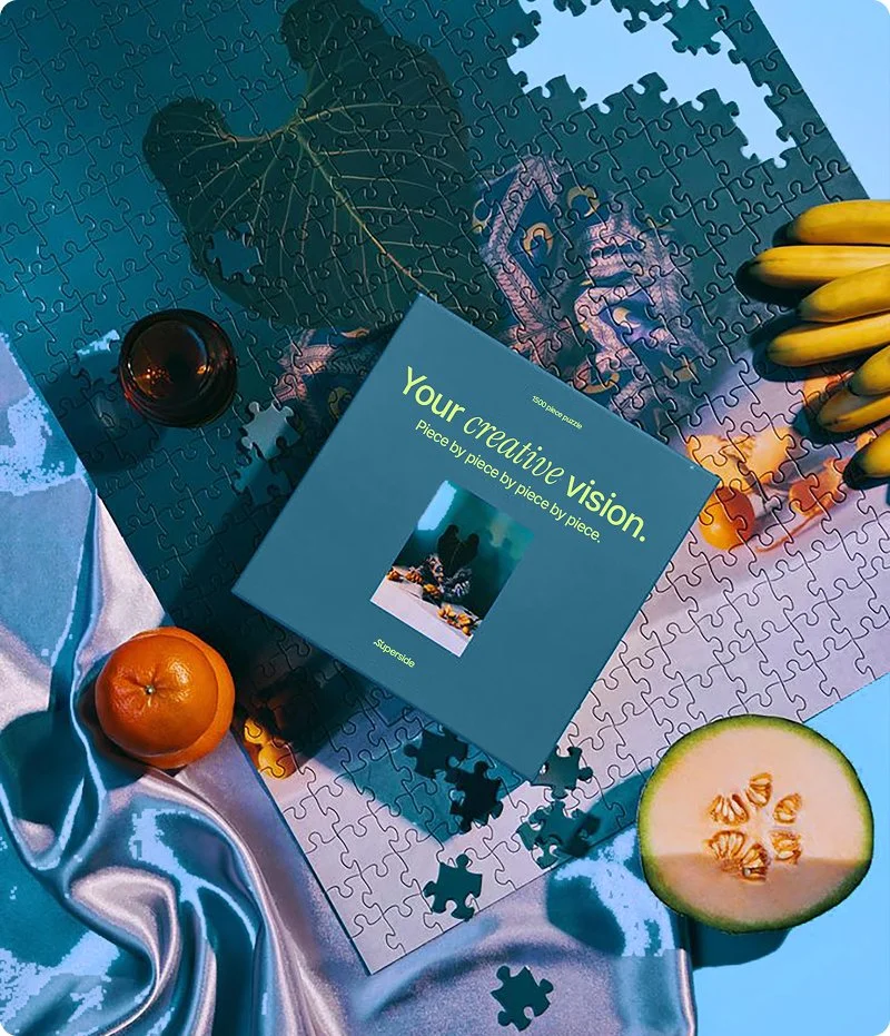
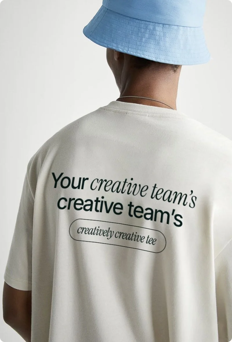
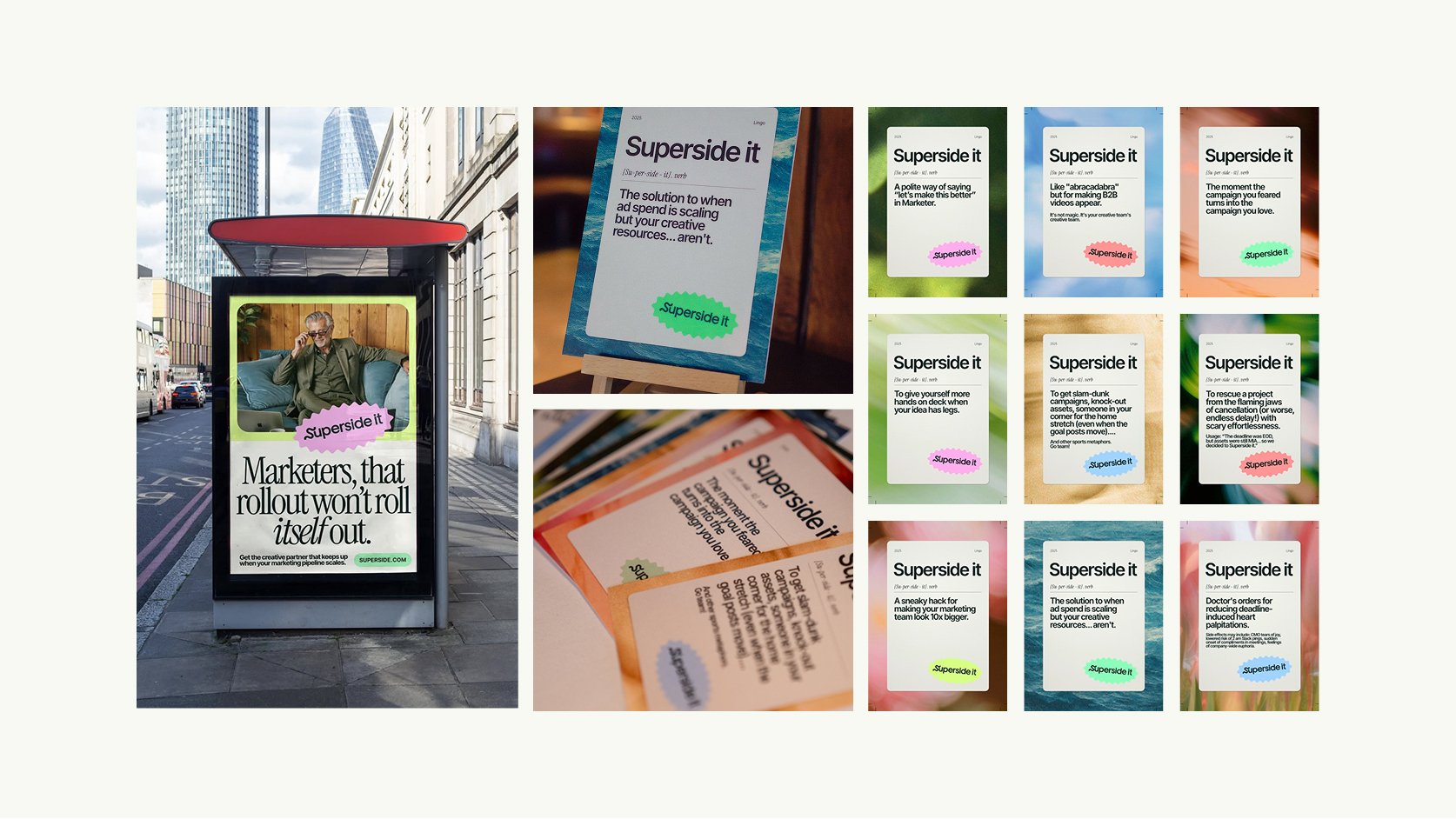
HOW THE BRAND TRAVELS • We built the toolkits for every part of the business that puts the brand in front of people. Event kits: signage, stage graphics, and the presentation templates speakers use to build their talks. Webinar kits: the platform assets and promo cuts that surround a session. In 2025, that system ran four summits, eight webinars and eight live events.