SHIFT: The Creative AI Summit
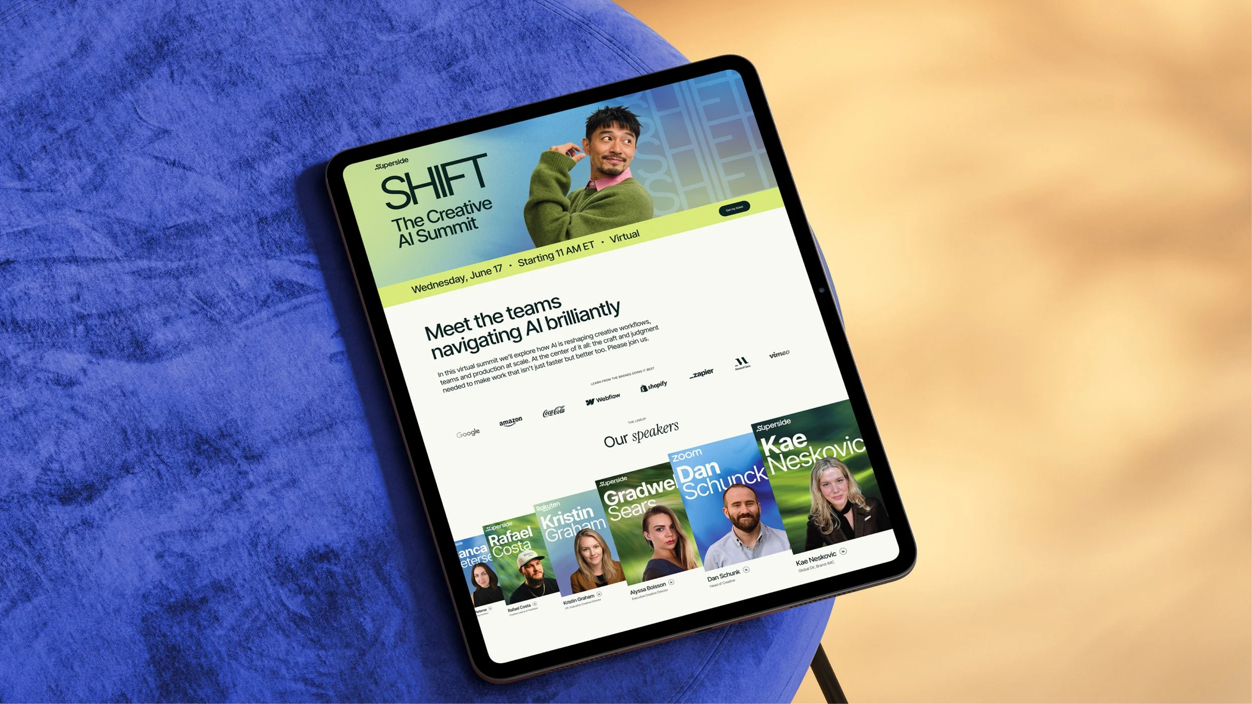
The first creative-only edition of Superside's virtual summit series explored how AI is reshaping creative workflows, teams, and production at scale, with craft and judgment at the centre as the drivers of better work rather than only faster work.
The brief suggested the event title "From AI experimentation to strategic advantage," which asks people to work out how advanced they are before they know what the event is, so we changed it to "Meet the teams navigating AI brilliantly" and made the promise a simple one: come and hear how creative teams at Snapchat, Rakuten, Zoom, Booking.com and Leonardo.ai are actually doing it.
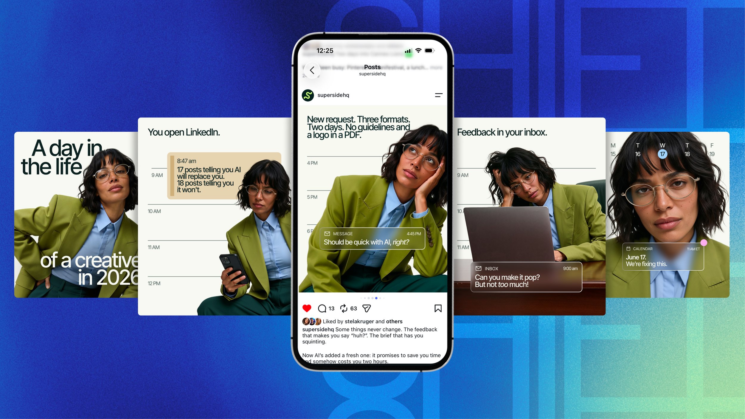
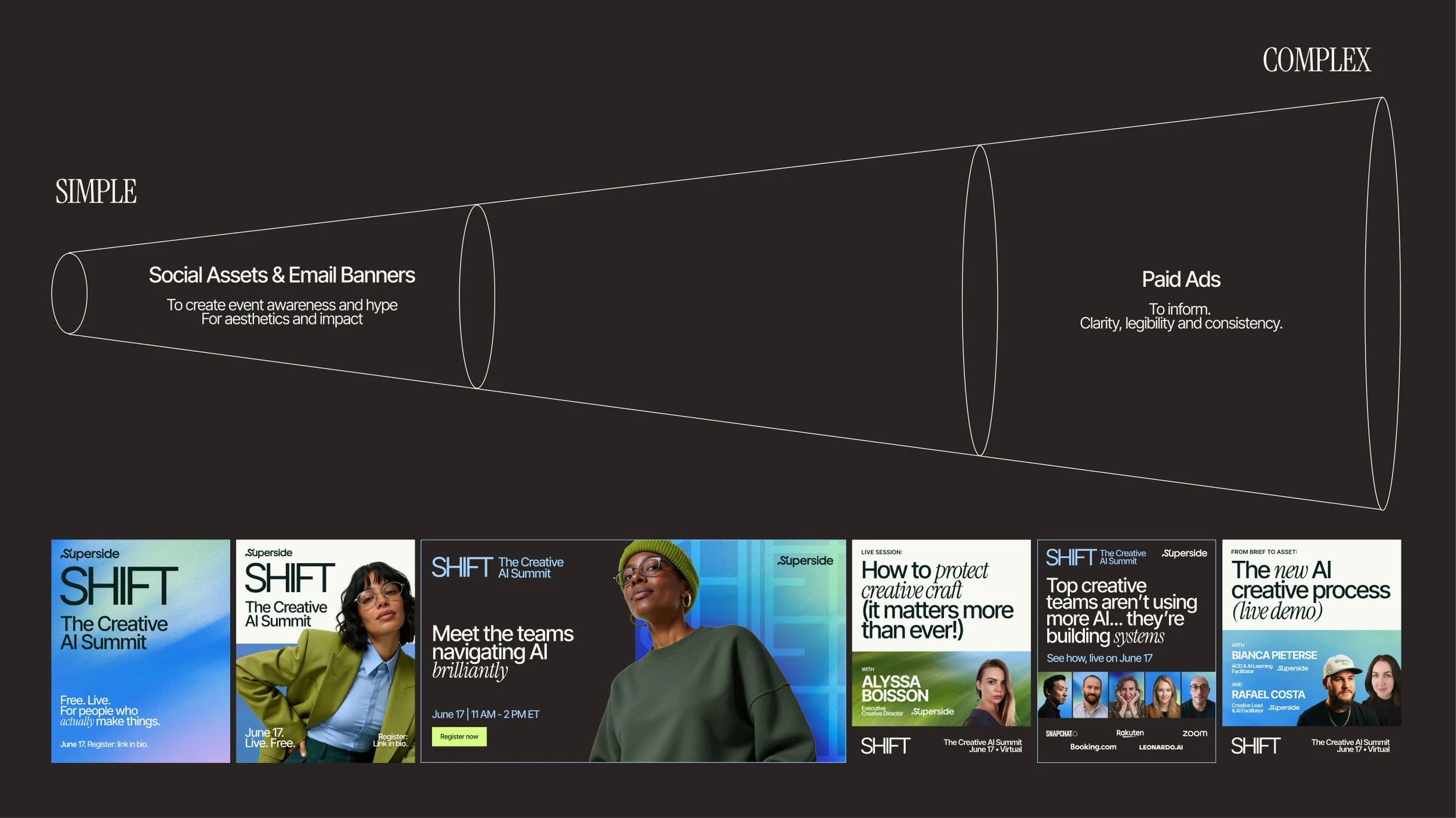
Past summits had leaned on a single hero image, which made the paid ads repetitive and hard to adapt, so this time we built a flexible layout system by stacking type blocks and colour fields that hold anything from a four-word headline to a five-speaker lineup, set over motion-blurred natural forms as this edition's take on the word "shift." The system dials up or down depending on the job, leading with atmosphere and imagery on organic social and email, adding speaker names and companies at session announcement, and stripping back to type, logos and a call to action in paid.
Attendance rate rose from 30.8% to 41.1%, with enterprise attendees up 43.4%. The summit delivered 2,959 MQLs against a 2,000 goal, and attendees rated the experience 4.5 out of 5 in post-session surveys.
Agency: Superside
VP Marketing: Josh Mendelsohn
Creative Directors: Graeme McCree, Piotr Smietana
Copywriter: Sam Newdigate
Graphic Design: Andrea Paz y Miño
UX/UI Design: Camila Giannini
Motion Design: Lucia Duclosson, Brandon Mistele
Project Management & Operations: Sofía Bittolo, Iliada Karamintziou
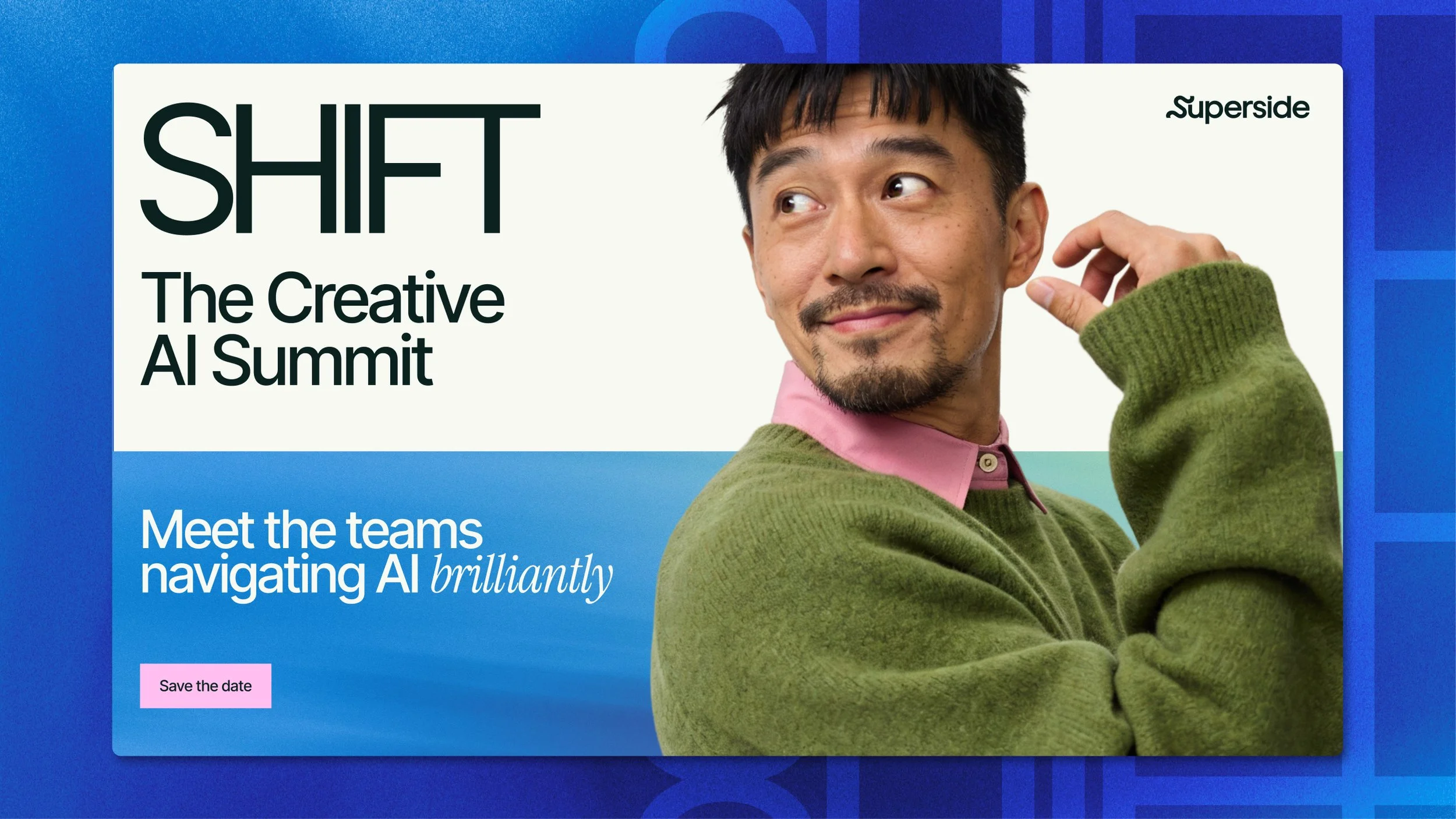
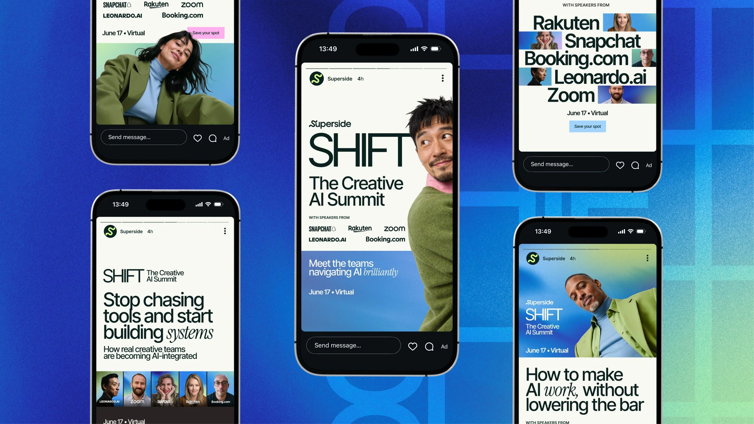
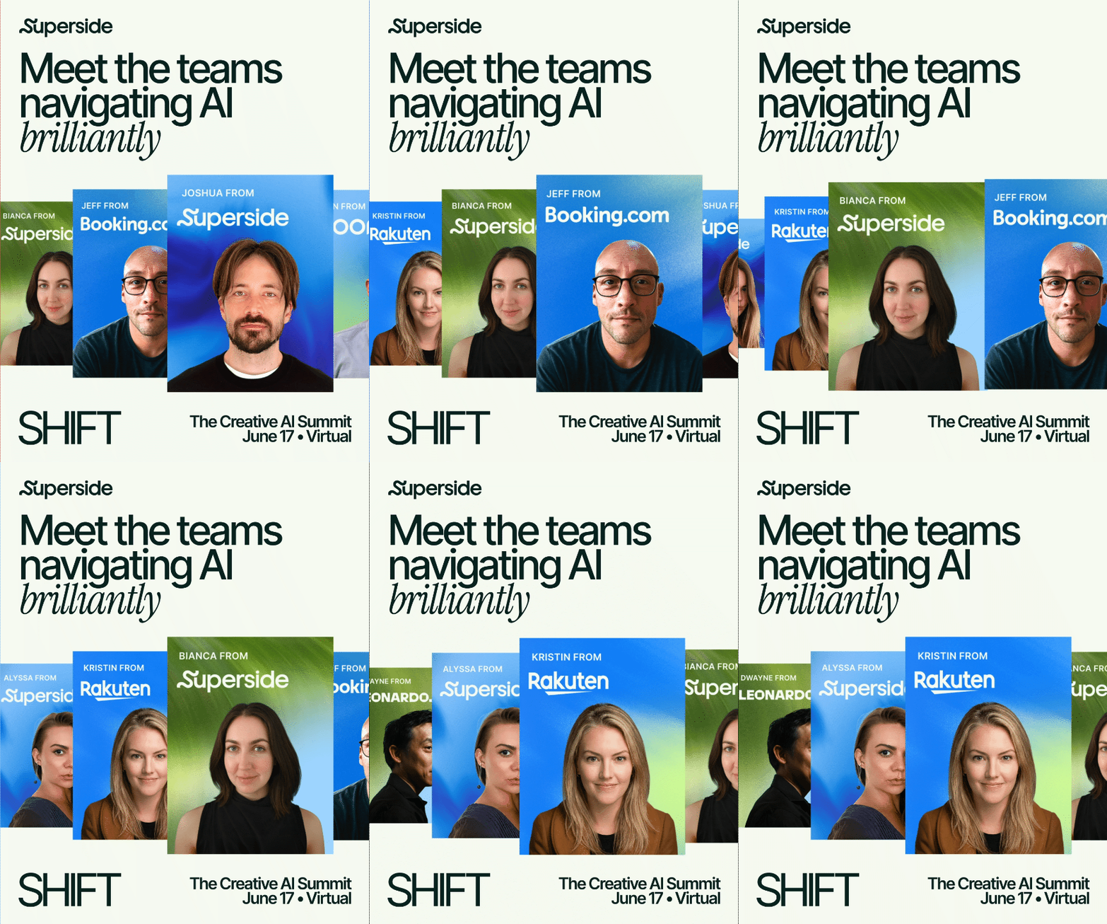
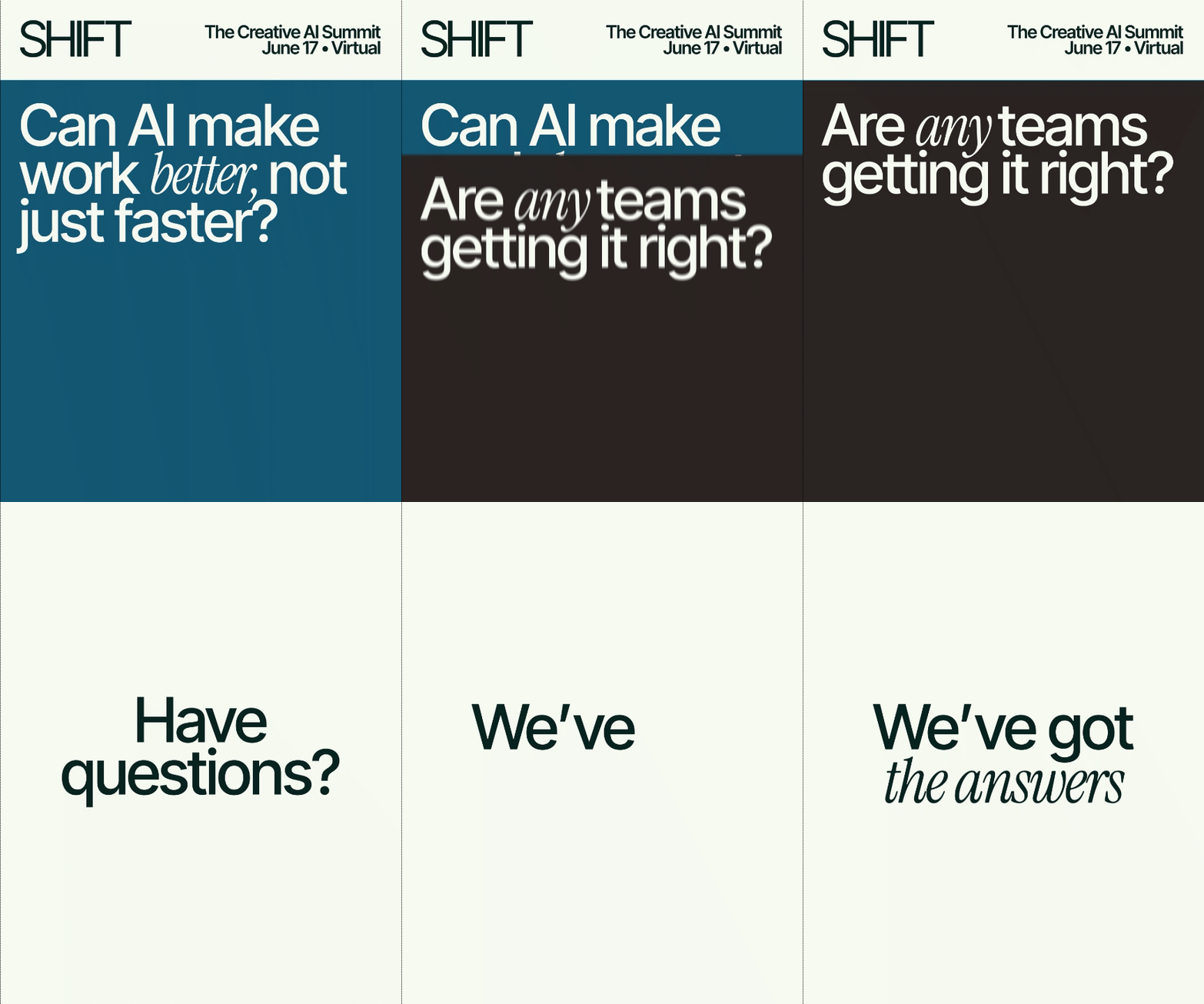
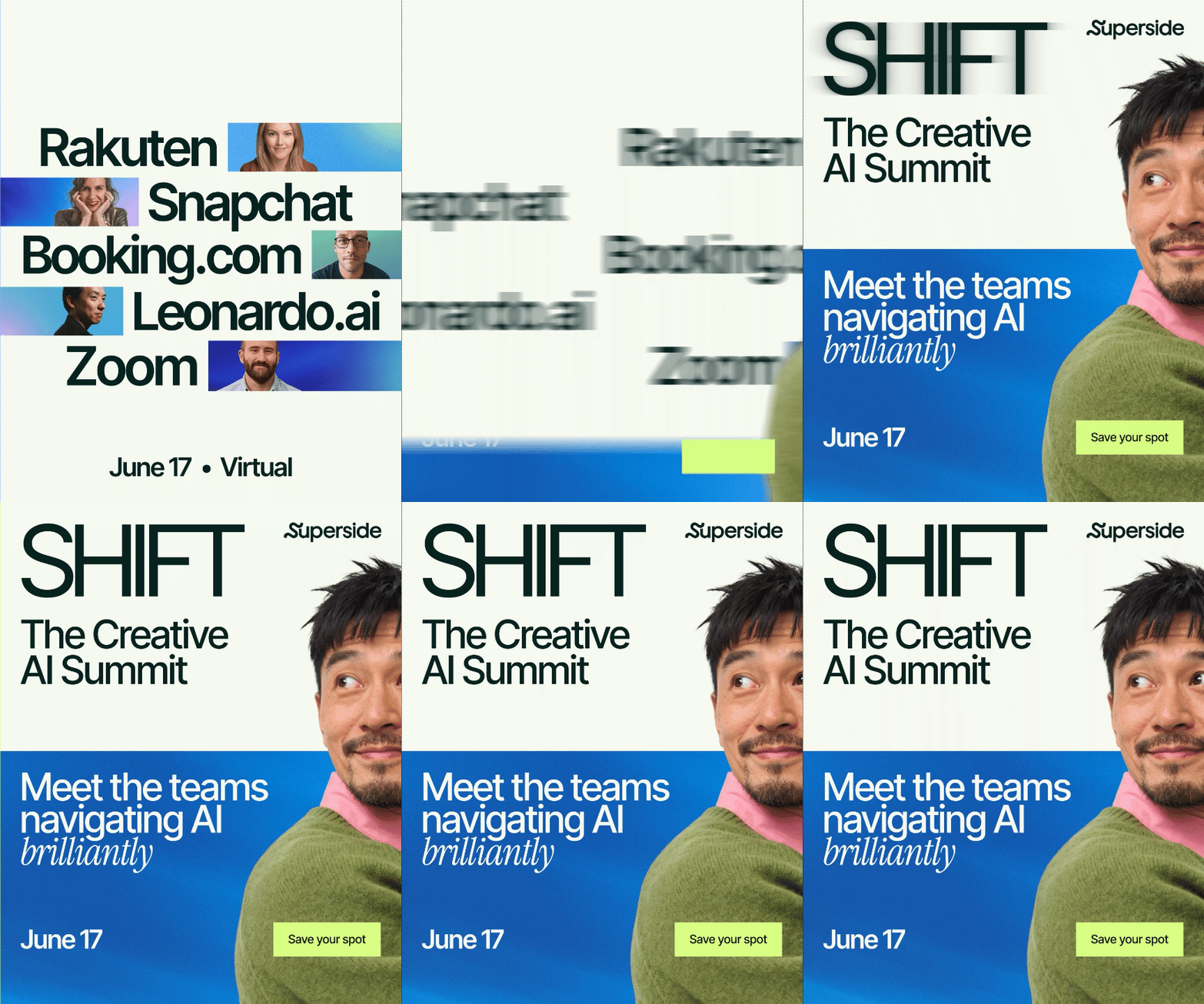
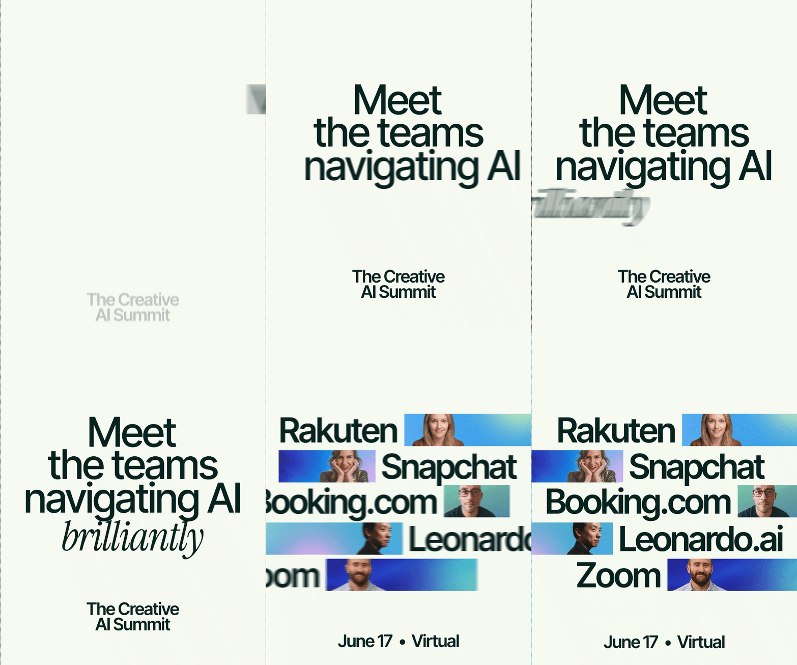
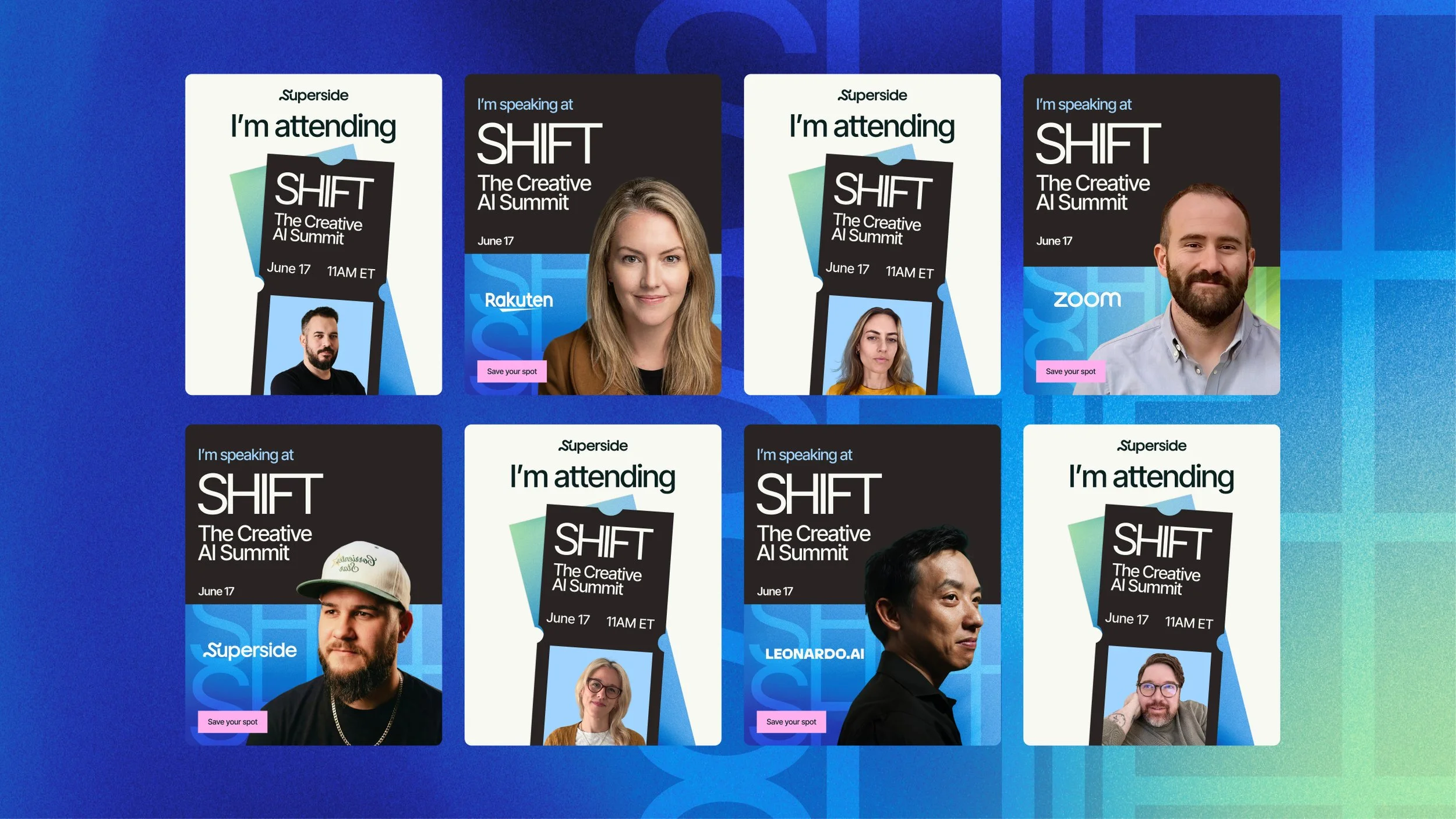
THE SYSTEM GETS SIMPLER AS PEOPLE GET CLOSER TO SIGN UP • At the top of the funnel, where the job is to catch attention, email banners and organic social lead with the key visuals. Session announcements add the practical detail: a name, a job title and a company. Paid ads strip everything back to type, logos and a call to action on a clean background. The more an asset has to prove, the less decoration it carries.
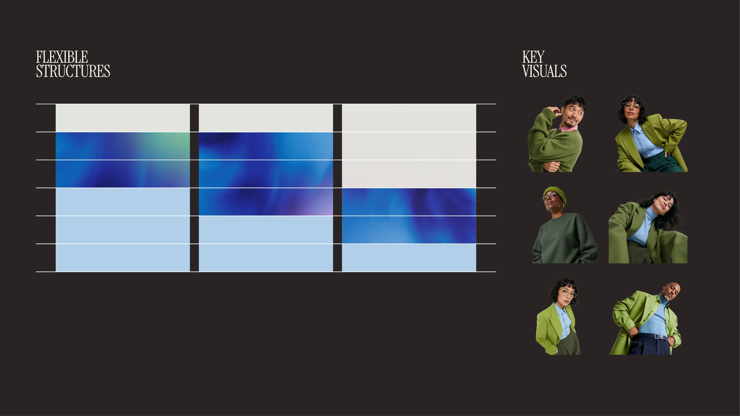
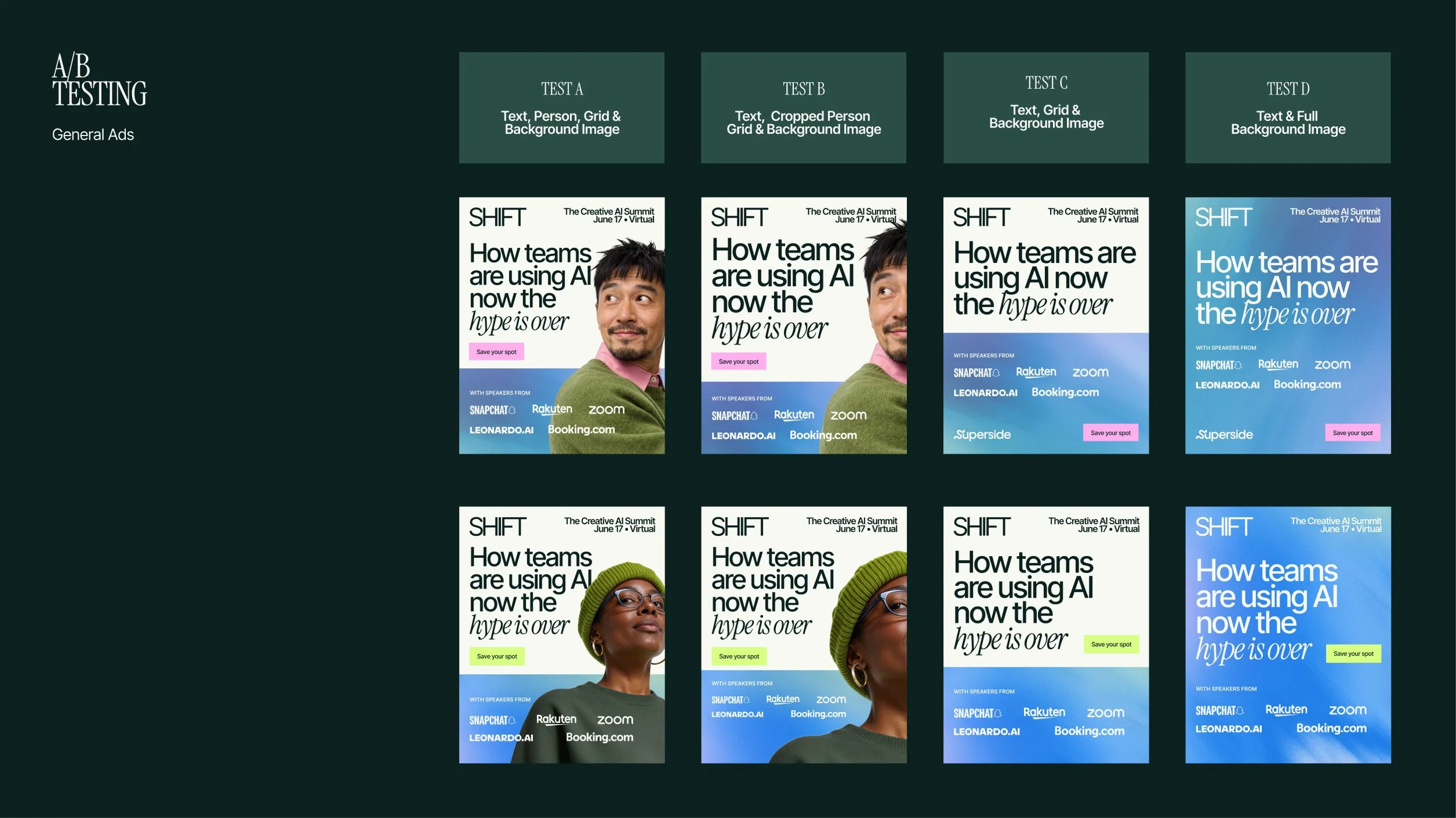
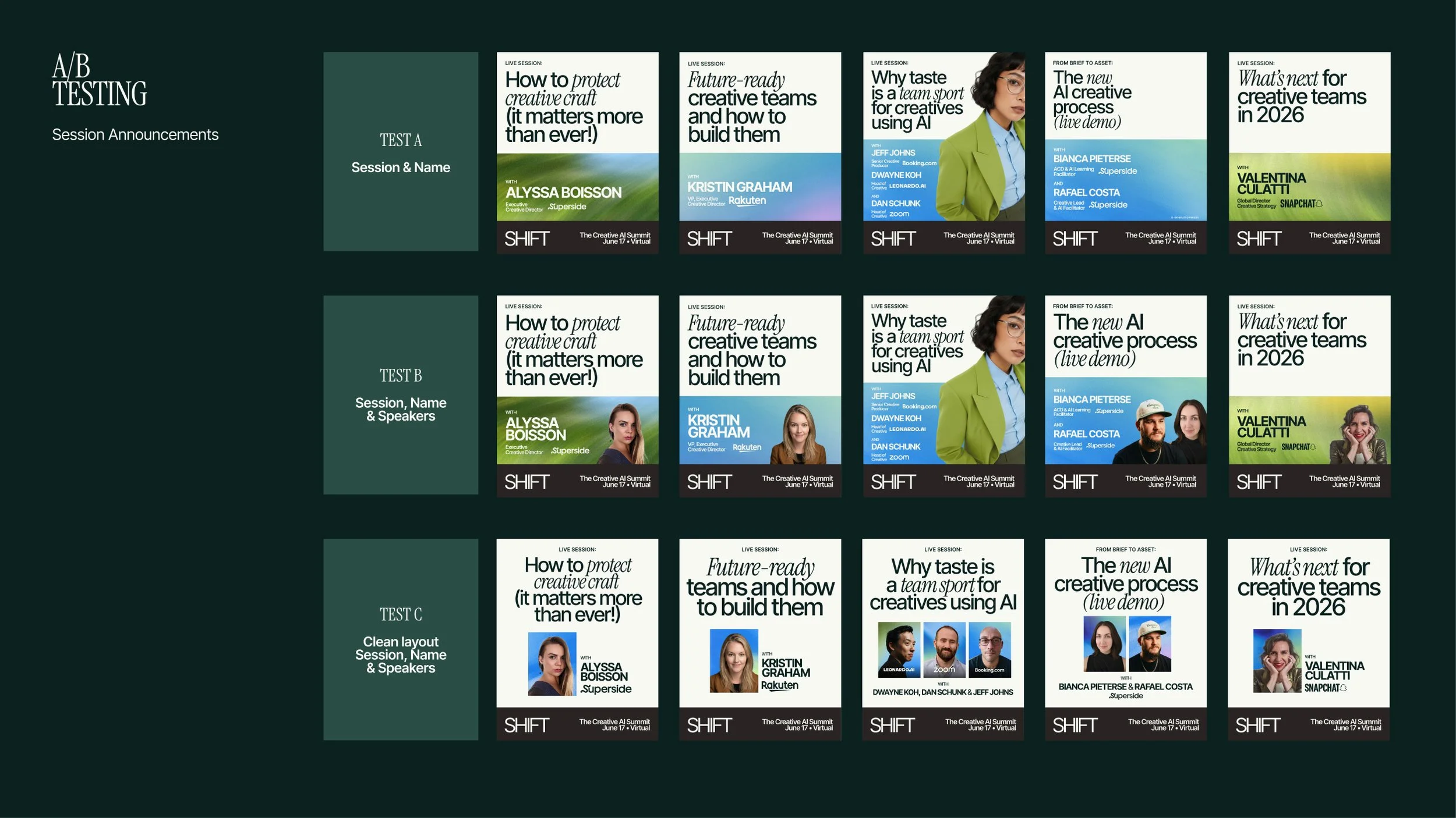
WHAT WE A/B TESTED • Two questions. First, what kind of image works hardest in a paid ad, and whether one is needed at all. General ads ran in four ways: text with a full AI-generated person, text with a cropped portion of one, a plain grid with no imagery, and a full-texture background with no imagery. Second, how much information a session announcement needs. Those ran three ways: session title alone, title plus named speakers, and a clean layout built around speaker portraits and company logos.
Cropped faces won. A whole person grabs the eye and then says nothing, while a tight crop leaves room for the message to land. Simple backgrounds beat segmented ones, and naming the speaker and their company beat naming the session.
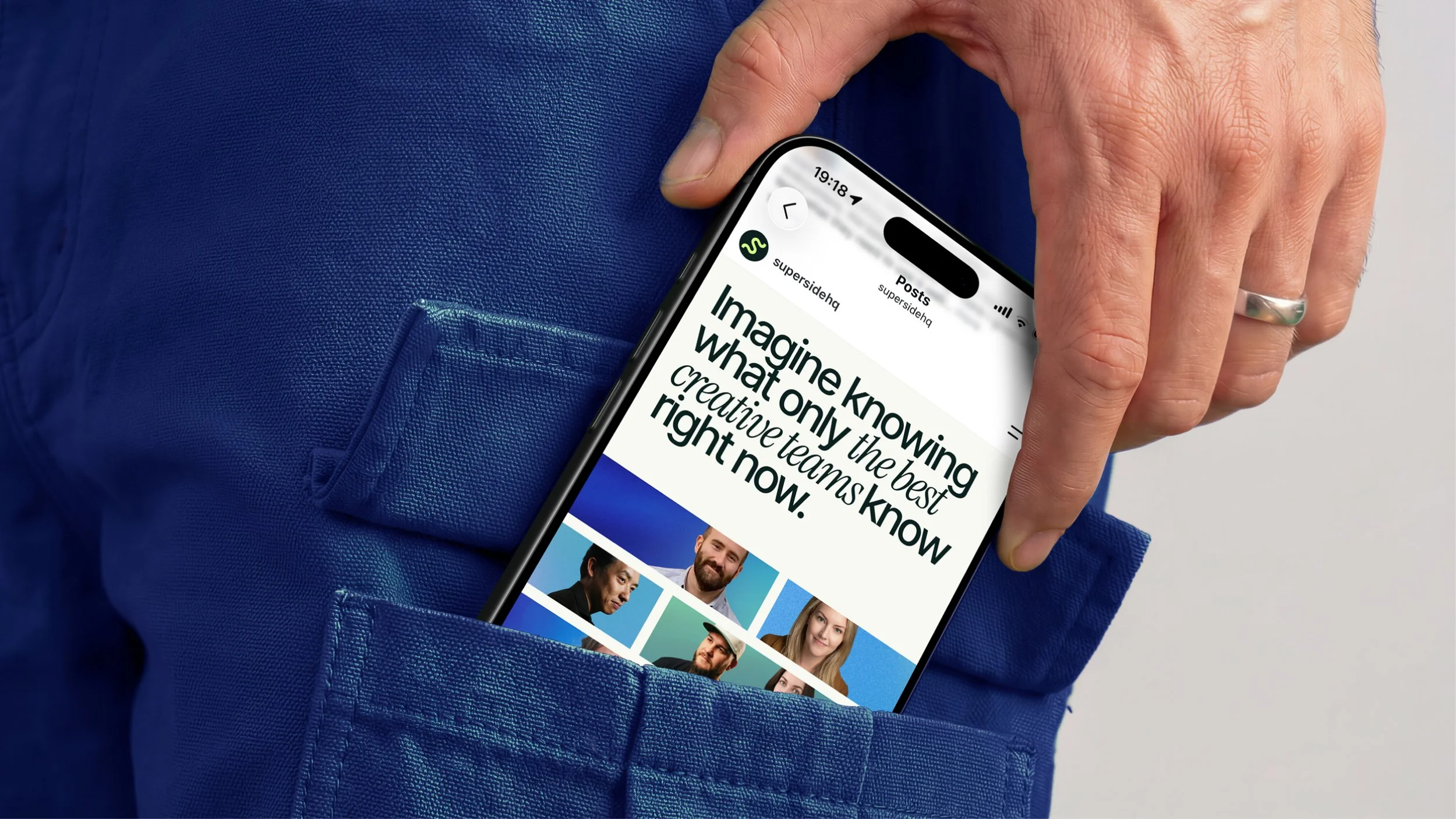
Social • Eleven posts drove 203,471 impressions, up 40% on the previous summit, at a 15.2% engagement rate, up 27.7%. The day-in-the-life carousel was the standout at 35K Instagram impressions. Speaker posts and "I'm speaking at" badges gave speakers something of their own to share, and the advocacy asset pulled 114K impressions.